The last thing we’re going to cover in this series is data visualization in Python. Today we’ll be taking a look at some of the graphing tools available in Python.
When it comes to visualizing data in Python, there are two main libraries that you’ll be using; Matplotlib and Seaborn.
There are advantages and disadvantages to each package, and it generally falls under personal preference, combined with your objective to determine which library you’ll use.
Matplotlib offers plotting tools for the majority of your basic graphs, where Seaborn has a larger focus on statistical visualization.
Moreover, it will depend on how you’ve stored your data within the application, since Seaborn is built for working with Pandas dataframes, whereas Matplotlib can handle both the dataframes and NumPy arrays easily.
One of the main deciding factors is that Matplotlib is just more customizable, including features that Seaborn removed for simplicities sake.
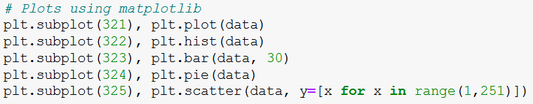
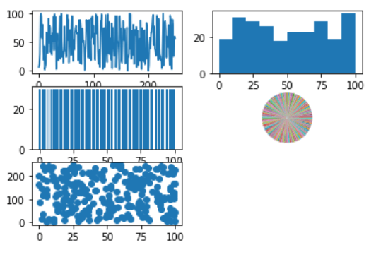
We’ll take a look at how to plot some charts using Matplotlib:
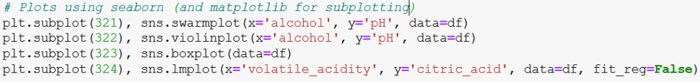
And we’ll also check out some plotting functions Seaborn:
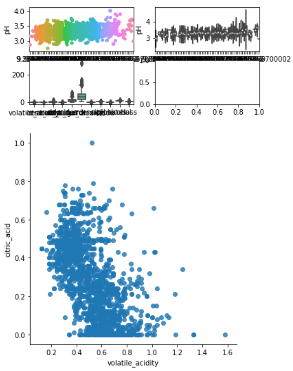
It’s pretty clear what all these functions do, or rather what the generated plots will be. So have fun with it, try messing around with the parameters and see what you can come up with.
Ultimately, as said earlier, the library you use will largely depend on the problem domain, so make sure to plan ahead! If you get stuck, read the documentation. The documentation for Python is extensive and will cover any question you may have.
And that concludes the Python tutorial series. I hope you found this helpful.
